UNDERSTANDING THE SYSTEM
)
Logo
Friendly and dynamic.
Download
External parties can request the logo package by specifying the intended use at marketing@sennder.com.
The lowercase letters together with the rounded font used in the logo are friendly and approachable but still clean and dynamic to match our mission. The symbol represents the connection, dynamism, and forward movement that sennder is bringing to the logistics industry.
 Construction.
Our logo is carefully constructed to maintain ownable characteristics while allowing for perfect legibility at any size on any application. The symbol is constructed based on the golden ratio and its size, proportions and structure are all connected to it..

 Clearspace
The clearspace around the logo is equal to the diameter of the symbol.
 Scale
Scale
Our logo is designed to scale to small sizes on print and screen. The smallest size being 20 pixels wide/0.85 centimeters wide.
 Colors
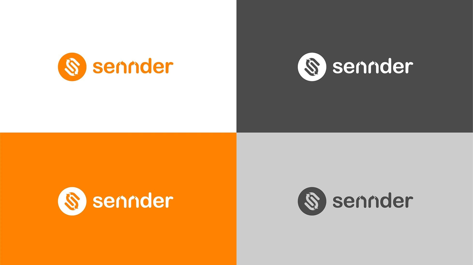
The logo should be orange on white background, or white on orange background, white on darker background and dark grey on lighter background depending on the composition of your document or slide.
 Placement
The position of the logo will depend on the graphic piece and the content that it contains, but as a general rule, the logo should be centered if alone in the format and on one corner if it shares space with more content.
 Partnerships
Aligning partnership logos should follow clear space rules. The separating line between logos is a vertical line at the same hight as the logo, placed in the middle of the suggested clear space, as shown below.
 Versions
The sennder brand is dynamic. The isotype and the logotype can be used separately and indistinctly. The vertical version of the logo can be used if it fits the format better than the horizontal primary one.
Typography
Primary font: Open Sans.
Our choice of font is approachable, human, yet clean and technical. Utilising it helps provide increased visibility and recognition across all touch points for the brand.

 Pairings
The wide variety of weights within the Open Sans font allows dynamism and hierarchy. Semibold weight should be paired with Light weight, and Bold weight should be paired with Regular weight.
Headline Box
As a part of our system and a way of getting visual attention, we use boxes to underline headlines. The text inside the boxes is Open Sans always in capital letters for headlines, and small letters for captions. There should be a margin between the box and the type for it to breath, as shown below.

 Boxed Colors
The boxes can use any of our brand colors. Just make sure the chosen color generates enough contrast between the background and the box itself. 
Secondary Font: Helvetica Neue
For long texts, paragraphs, lists, or anything but titles, subtitles, headlines and captions, we use Helvetica Neue, a highly readable font. A sure move that will always work out.
Hierarchy
It is important to organize typography in a hierarchical system according to relative importance or inclusiveness through scale and function depending on communication.


Typography Colors
The type should be dark grey on lighter backgrounds and white on darker backgrounds. The color of the typography should never be black but rather dark grey. Check colors for sennder color codes.
 Colors
The Orange
Challenging, optimistic, passionate about what you do, always going the extra mile, delivering for customers, being progressive and successful but also doing something that matters for our carriers. This is what the color Orange means to us.

Primary Colors
Our primary brand colors are orange and white. The orange we use is the most dominant color in all our marketing materials to attract attention and direct the user to an important factor. The white color is used to counter the orange's euphoric energy.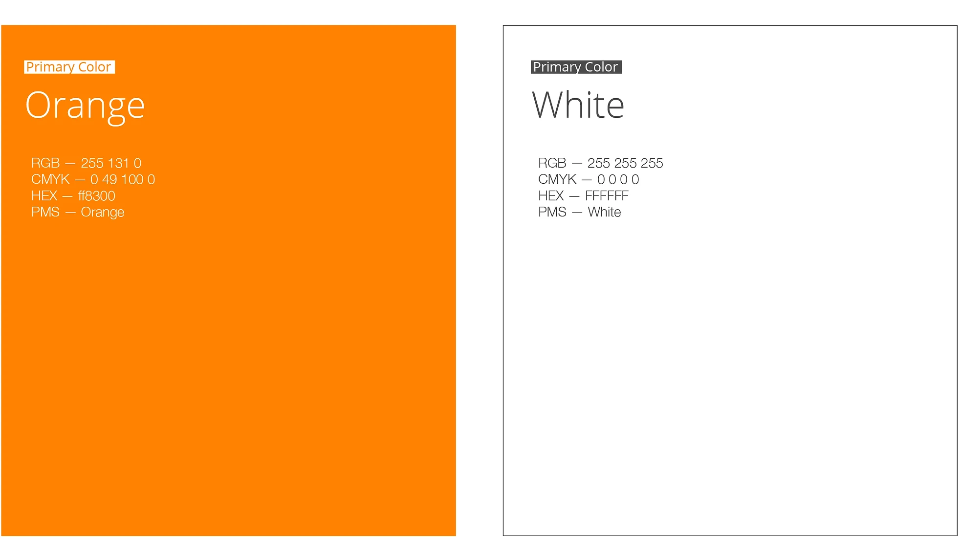
Secondary Colors
Our secondary brand colors are the dark and light grey. The dark we use to compliment and tone down our orange, and to bring more subtle accents into the design. The ligher grey we use to display content that is subtle and needs to stand out less and when we need an extra color to represent content that is secondary to context.

Usage Proportions
It is important to follow the rules of these proportions when creating any brand communication in order to maintain brand consistency and remain accessible for all people.
Color Guidance
Avoid any of the following practices:
Combining brand colors in a way that doesn't secure enough contrast.
Color effects or creating new colors
Displaying the logo on a color not specified on this brand guideline.

Using black typography instead of the sennder dark grey.
Using a black background.
Using orange typography on any other background but white
 Color Applications
The following applications are allowed:
(✓) Combining brand colors in a way that secures contrast.
(✓) Using black and white color effect.
(✓) Using white over an orange background

(✓) Using dark grey text over light grey or white backgrounds.
(✓) Using white text over dark grey background or over darker imagery.
(✓) Using orange typography over a white background.

Photography
Young. Wild. Free.
Our photography curatorship should aim for boldness and clearness and should inspire the viewer with a sense of movement, freedom, youth, and freshness.

Beyond trucks
Although we are in the logistic industry, it is not necessary to include a truck or a road in every single picture. Solid branding is not about the "what" or the "how"... is about the "why". Photography is a great tool for inspiring the audience with sennder's more abstract core values and its spirit.
Logistics: Logistic related images. Use this to talk about the business and the industry.
People: "Human" is one of our core values. Let's make it about people and not about machines.
Concepts: Images can be very useful for representing abstract concepts in a beautiful way.

Processes: To show processes or talk about design, business management, creativity, etc.
Orange: Embrace the orange. Play around with this folder full of orange imagery.
Offices: Our offices are great! Let's share what these spaces look like with the outer world.

Tech: A set of futuristic pictures about technology and digitalization to include in sennder graphics.
Places: We are a global company. Pictures of the places our offices are located.
Internal: Succeed as a team! The best pictures of sennder's events and lifestyle.

Photography Guidelines
Avoid any of the following practices:
Framing the pictures.
Using pictures with doubtful quality. If it doesn't look great and professional, is better not to use it.

Cropping the pictures into circles or any other shape.
Cropping the pictures into circles or any other shape.

Writing text over complex content making it hard to read.
Using generic photo bank pictures that look fake or overacted.
 Photography
The photos should be placed without a frame, covering either the full area or half of it vertically or horizontally as shown below:


 Iconography
Simple line icons
Our icons are inspired in our symbol, as they are friendly, dynamic and rounded. They have the exact level of detail that allows to represent complex concepts while still remaining simple. 
Colors
The set of icons is available in the following colors, which can be used indistinctly.

Combinations
To secure readability and the right level of contrast, and also to take care of the aesthetics, there are a limited number of color combinations allowed. Orange icons can only be displayed over white background, white icons can be displayed either over dark grey or orange background and dark grey icons can only be displayed over white and never over the orange background.
(✓) White icon over an orange background.
 (✓) White icon over dark grey background.
 (✓) Dark grey icon over white background.
(✓) Orange icon over white background.

Hierarchy
It is important to organize icons in a hierarchical system according to relative importance. We can highlight a specific concept through color. Icons should always be the same size within the same composition.

What if I can't find or access the asset I need?
If you can't find or access the asset you are looking for, please contact marketing@sennder.com and specify which materials you need and the intended use.
Do I need to install the sennder typographies before using the templates?
Yes, you need to install all of the sennder typographies before downloading any of the sennder assets. If you don't do this, the template might show a random alternative typography instead.
What if I can't find the picture I need in the Photo Bank?
If the concept you need to represent is not in the sennder Photo Bank you can go to Unsplash and try to find a picture there. Just make sure to follow the Photography Guideline.
How do I install the typographies on my laptop?
For installing the typographies on your laptop you first need to download the type files. After doing that you need to open the type files and follow the installation instructions.
What's the difference between PNG, PDF and SVG?
PNG is the image file format you will need in most cases because it allows a transparent background. PDF and SVG are both vector formats, so you can use them for very large images without risking the resolution. PDF will serve for printing uses, while SVG is the format you are looking for if you need to edit the content with a vector software.
Can I use a different typography?
To secure the brand coherence we need to be consistent, so try to stick with the fonts specified in the typography section. You can find where to download them if you don't have them yet installed in your laptop.
What if I can't find the icon I need?
If you can find the icon you need on the sennder Icon Bank you can request it here. If you need it super fast you can find more icons on The Noun Project but you need to make sure to choose an icon that matchs the iconography styleguide, so it needs to be made out of lines and lines only, has the same thickness and level of detail as our sennder icons and be in the same sennder colors.